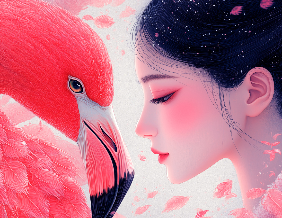
玫瑰不必具象为花,Rose Glow的 “Rose” 是一种态度 —— 自带锋芒的张力,亦是冲破桎梏的勇气。品牌以 “唤醒美、重塑自我” 为内核,聚焦渴望变美、追求自信与时尚的群体,不执着于单纯的技能习得,而是深耕情绪价值 + 成长反馈的双重赋能,助力每个人在蜕变中闪耀光芒。
LOGO 以三个由粗到细的圆形为核心视觉符号,摒弃繁杂设计,用简约直观的形态诠释 “重塑” 的本质:圆的渐变变化,对应着从胖到瘦的身材蜕变、从粗粝到精致的气质进阶、从无力到活力的状态焕新,将 “优雅、时尚、绽放” 的品牌关键词转化为可感知的视觉语言。
律动的线条变化,既传递出品牌 “打破定式、持续生长” 的精神内核,也构建了独特易记的符号记忆点。在 Rose Glow,每个圆的收缩与舒展,都是一次自我点亮的过程 —— 无关他人定义,只为遇见更自信闪耀的自己。
A rose does not have to be depicted as a literal flower. For Rose Glow, "Rose" represents an attitude—a sharp, unyielding vitality that defies constraints.
With "awakening beauty and reshaping the self" as its core mission, the brand caters to groups aspiring for beauty, confidence and fashion. Instead of focusing merely on skill acquisition, it commits to dual empowerment through emotional value and growth feedback, enabling everyone to shine brightly amid their transformative journey.
The logo features three circles tapering from thick to thin as its core visual element. Ditching intricate designs, it uses a minimalist, intuitive form to embody the essence of "reshaping". The gradual variation of the circles echoes physical transformation from plump to toned, temperamental refinement from unpolished to elegant, and mental rejuvenation from listless to vibrant. This turns the brand keywords—radiance, elegance, reshaping, fashion, confidence and blooming—into tangible visual language.
The dynamic, evolving lines not only convey the brand’s core spirit of "breaking stereotypes and sustaining growth", but also create a distinctive, memorable symbolic identity. At Rose Glow, the contraction and expansion of each circle marks a process of self-illumination—not for meeting others’ expectations, but for embracing a more confident and radiant version of oneself.