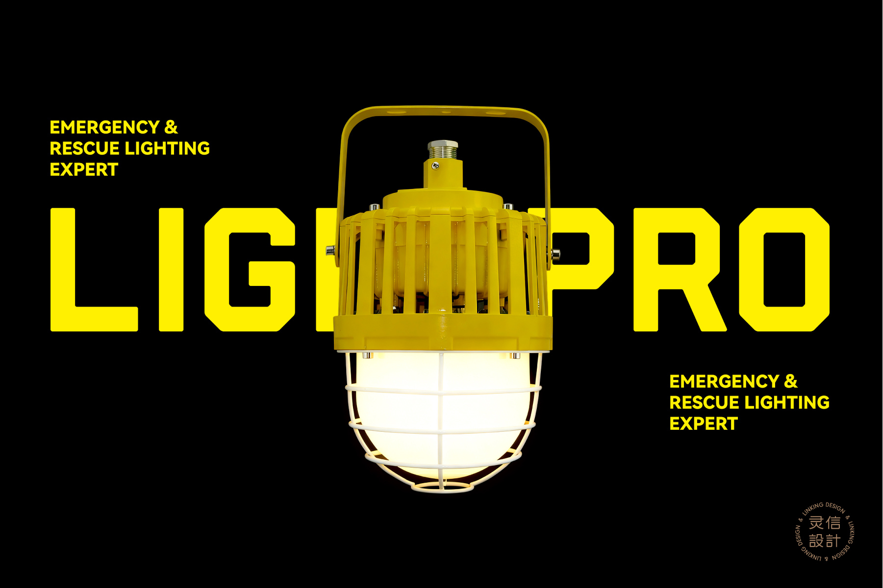
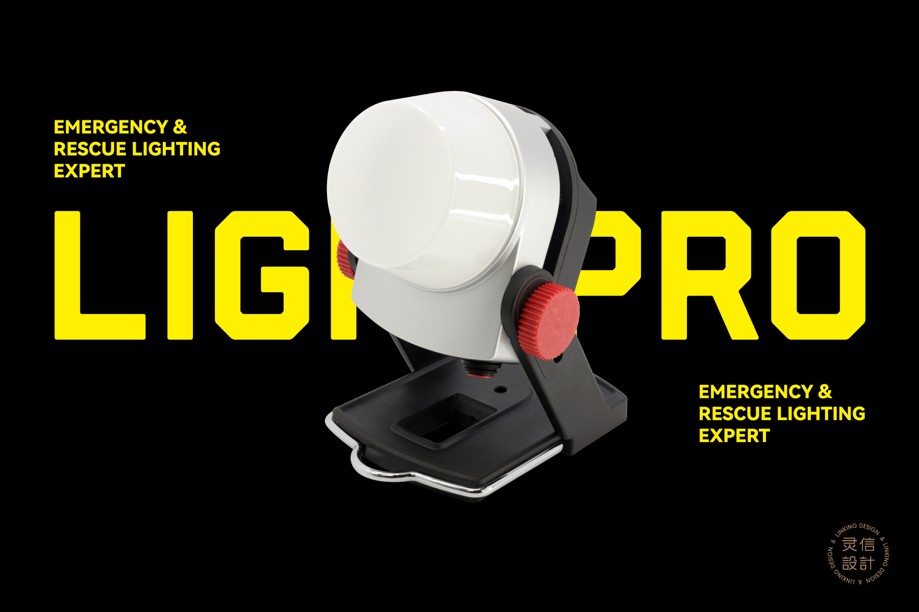
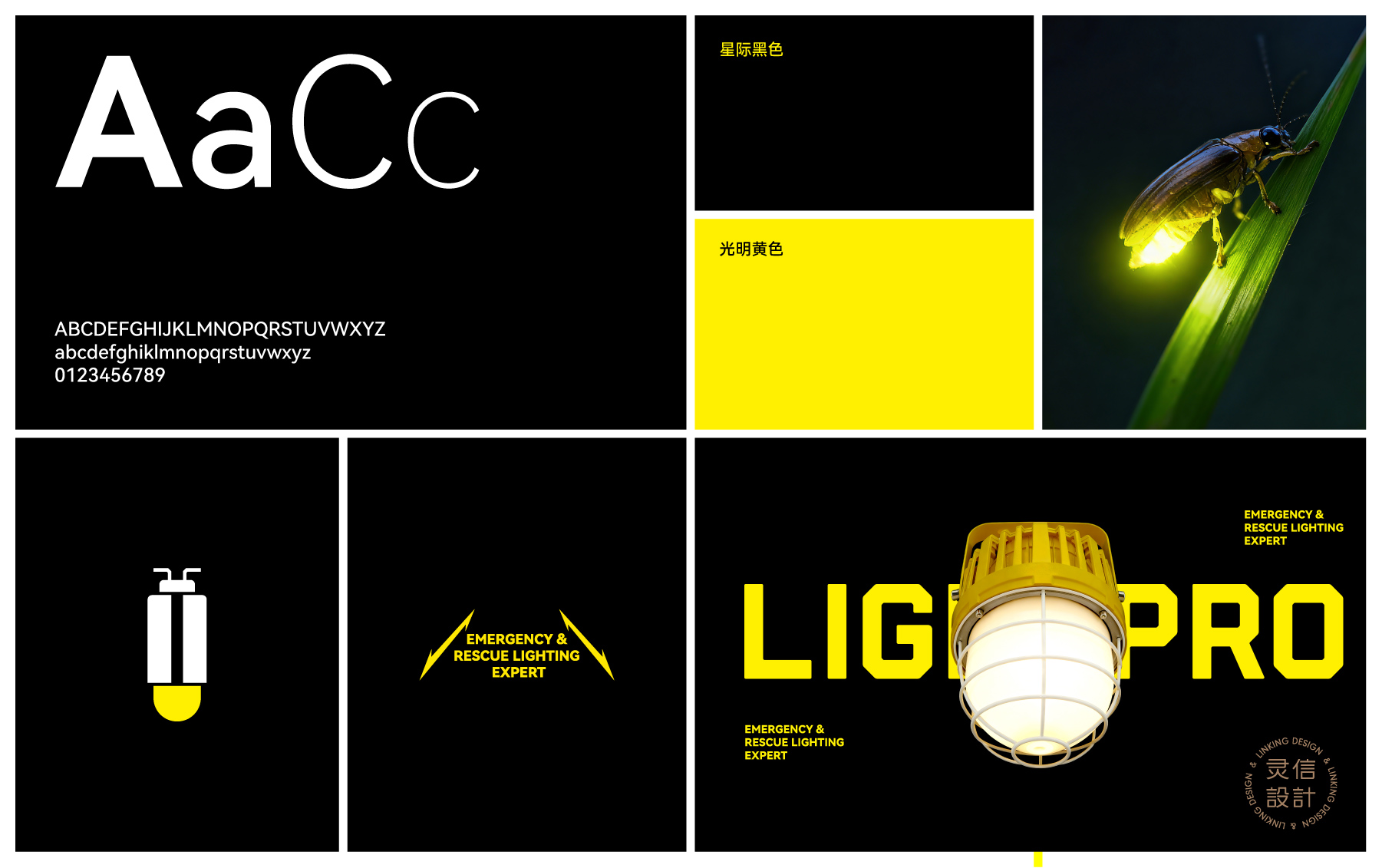
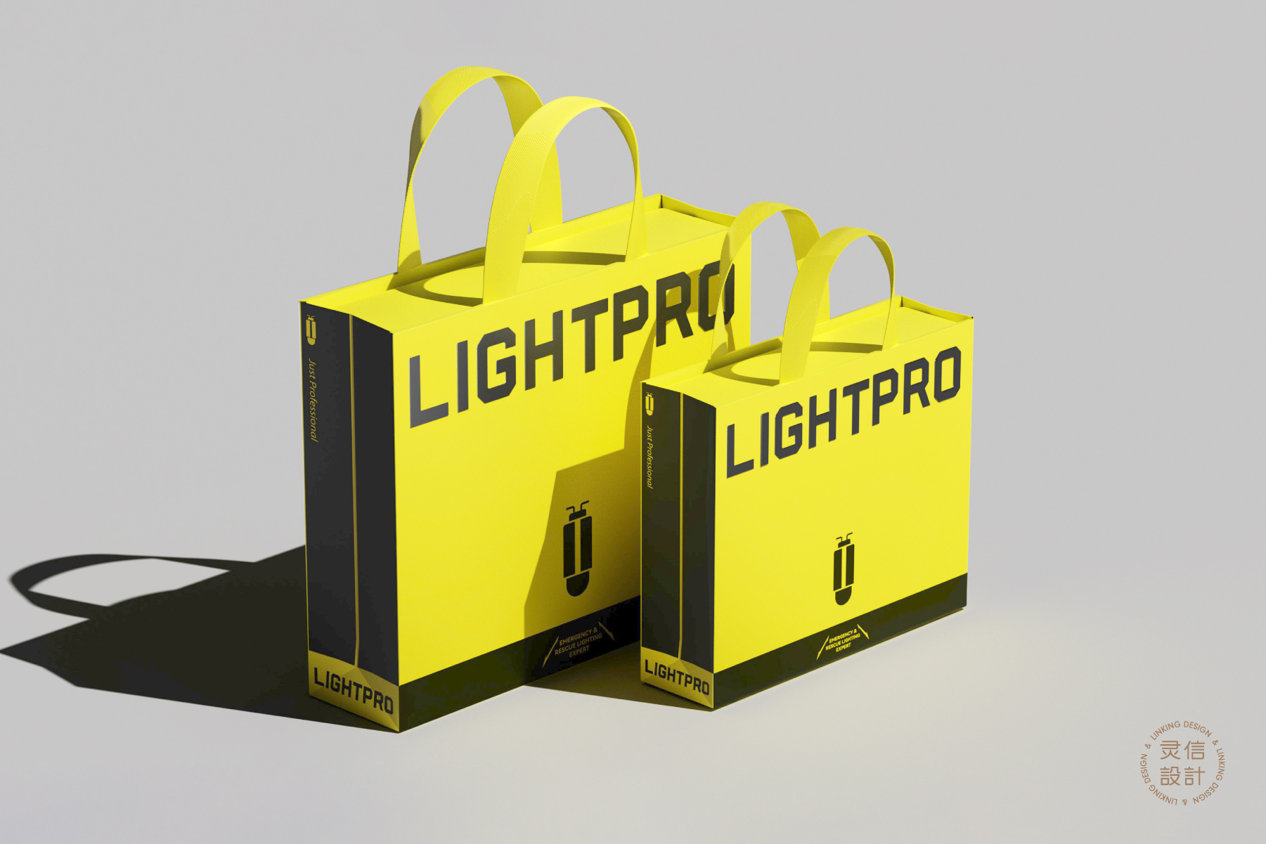
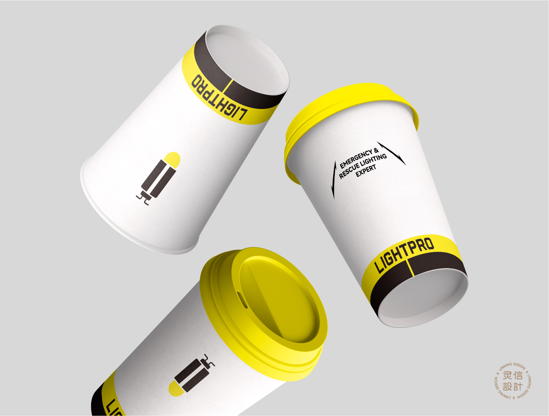
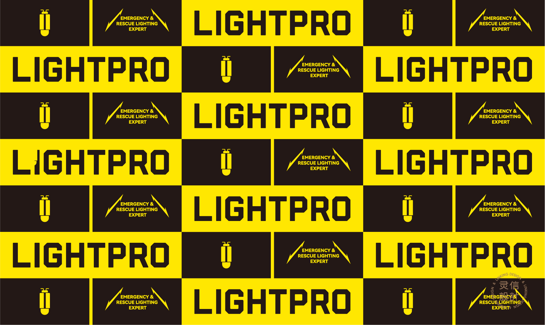
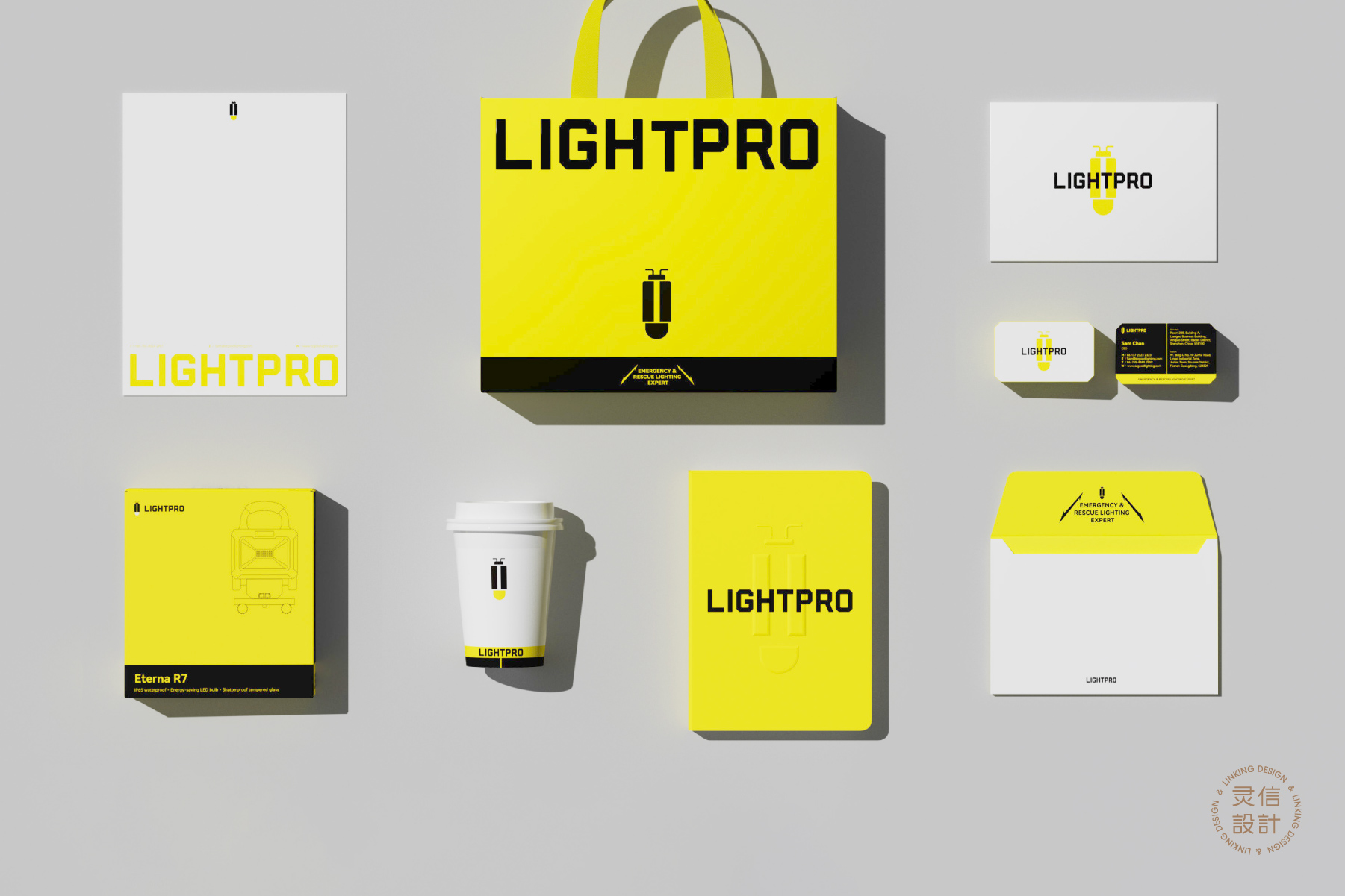
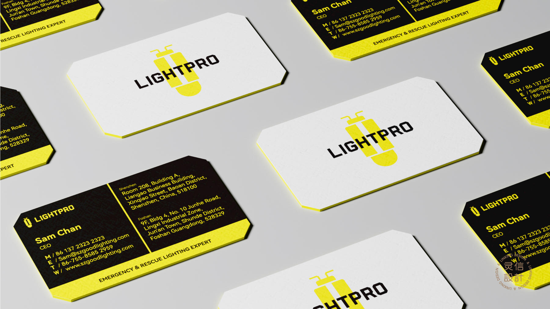
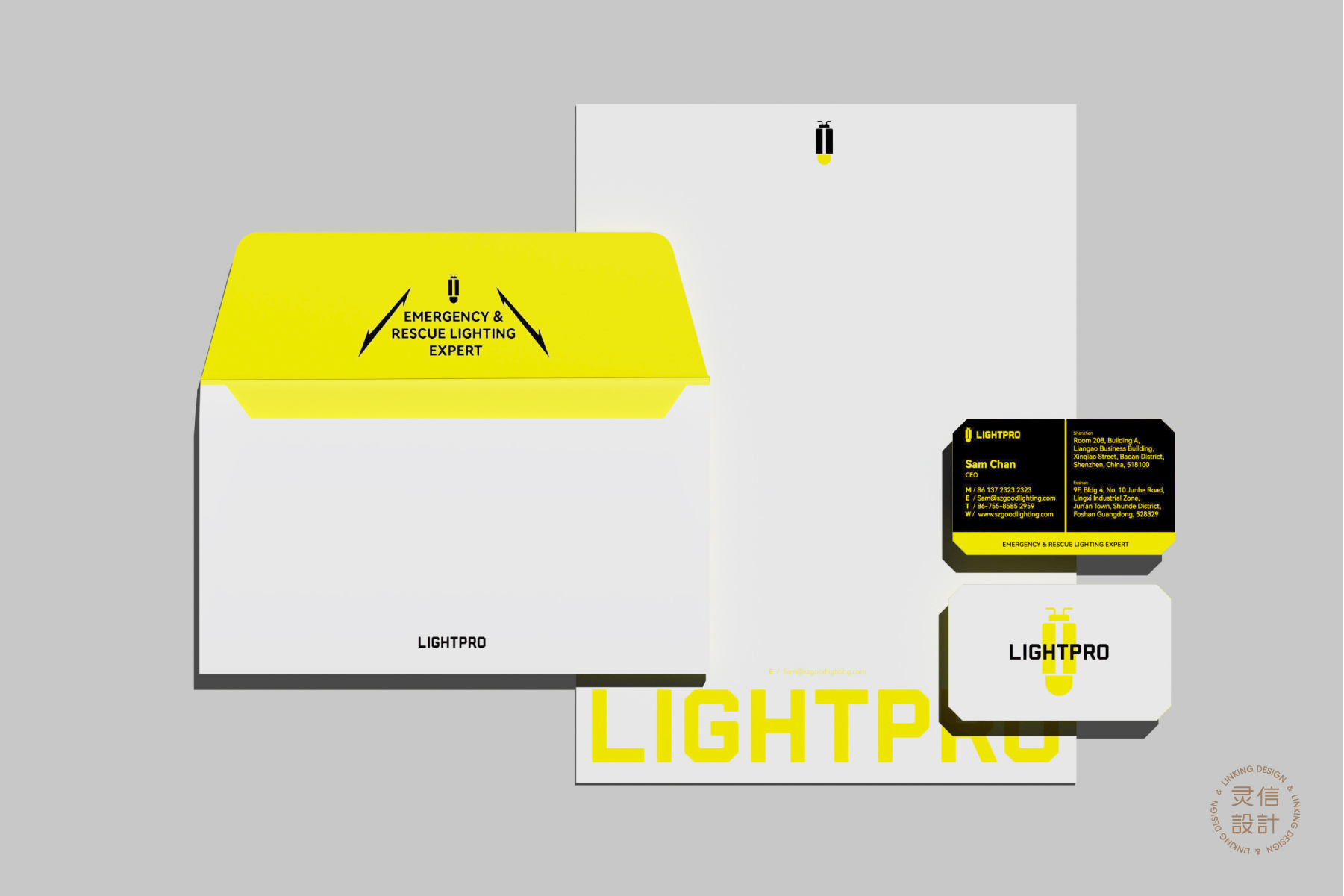
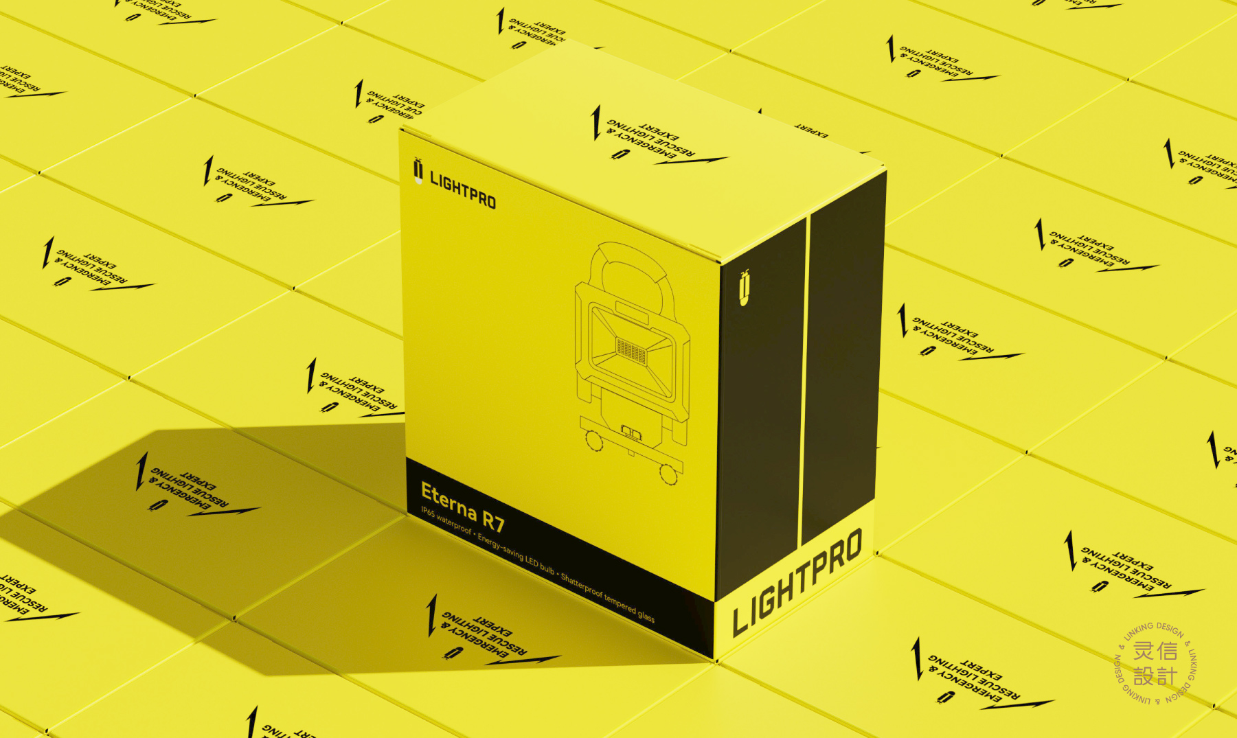
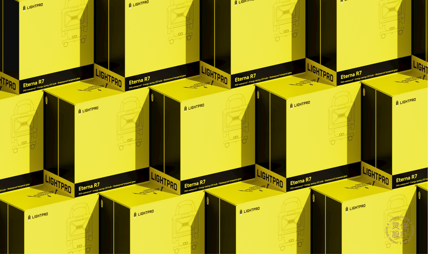
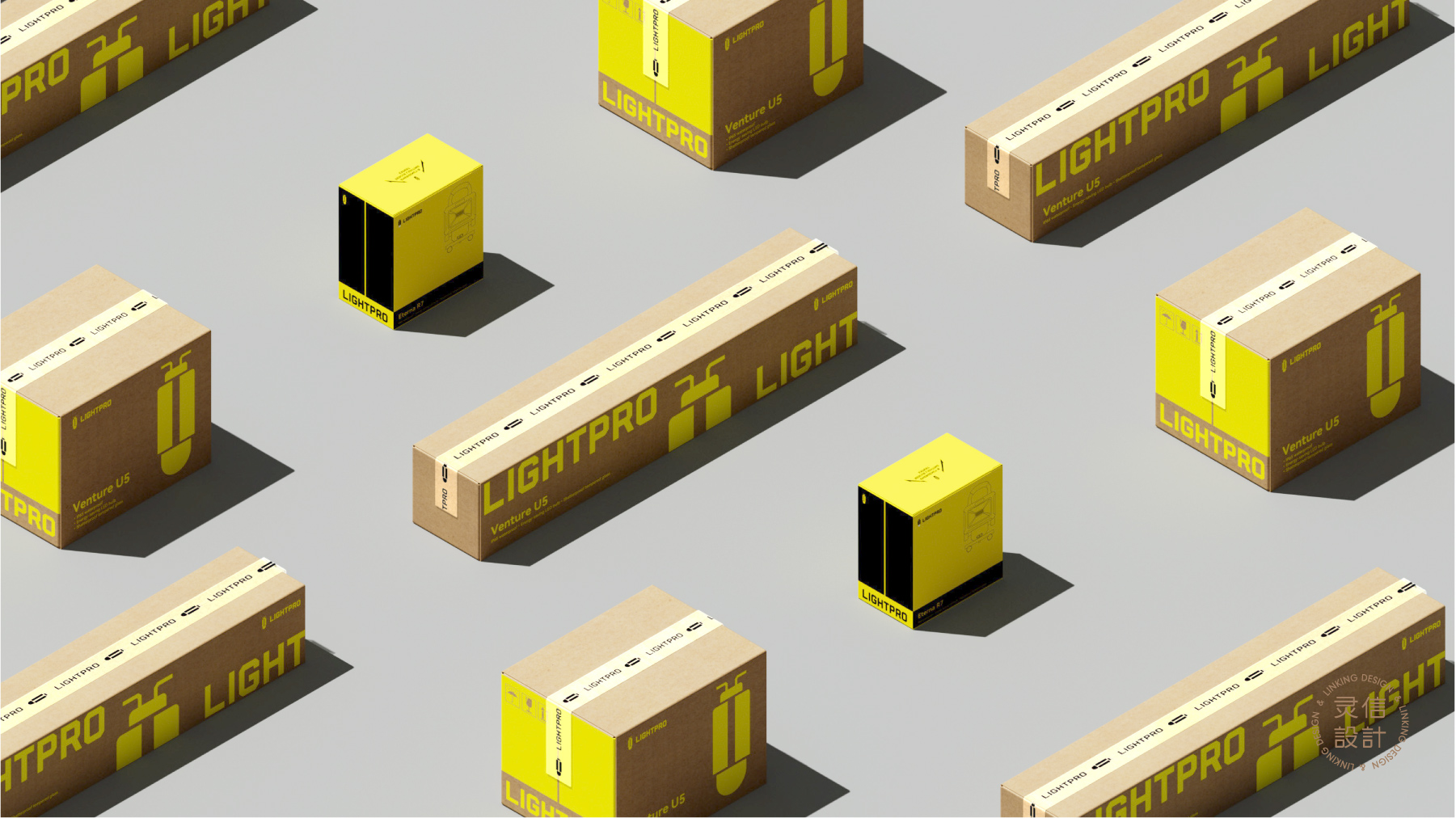
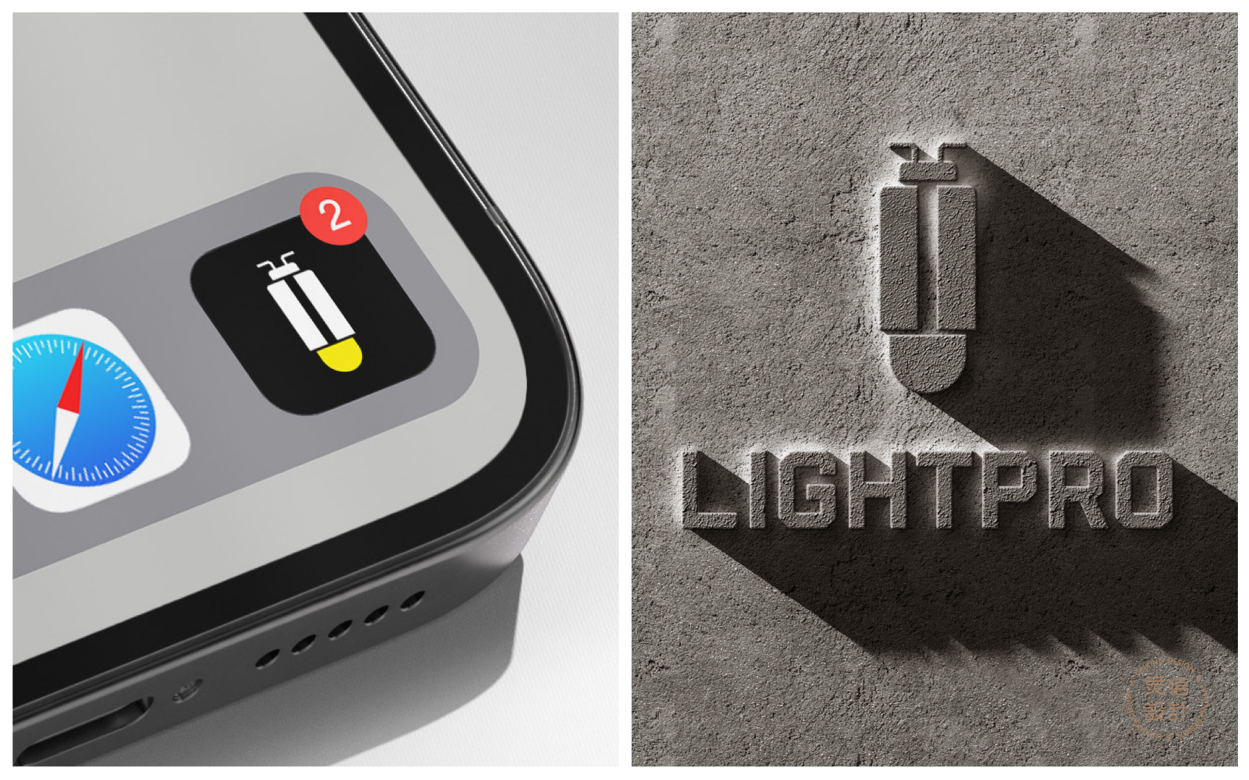
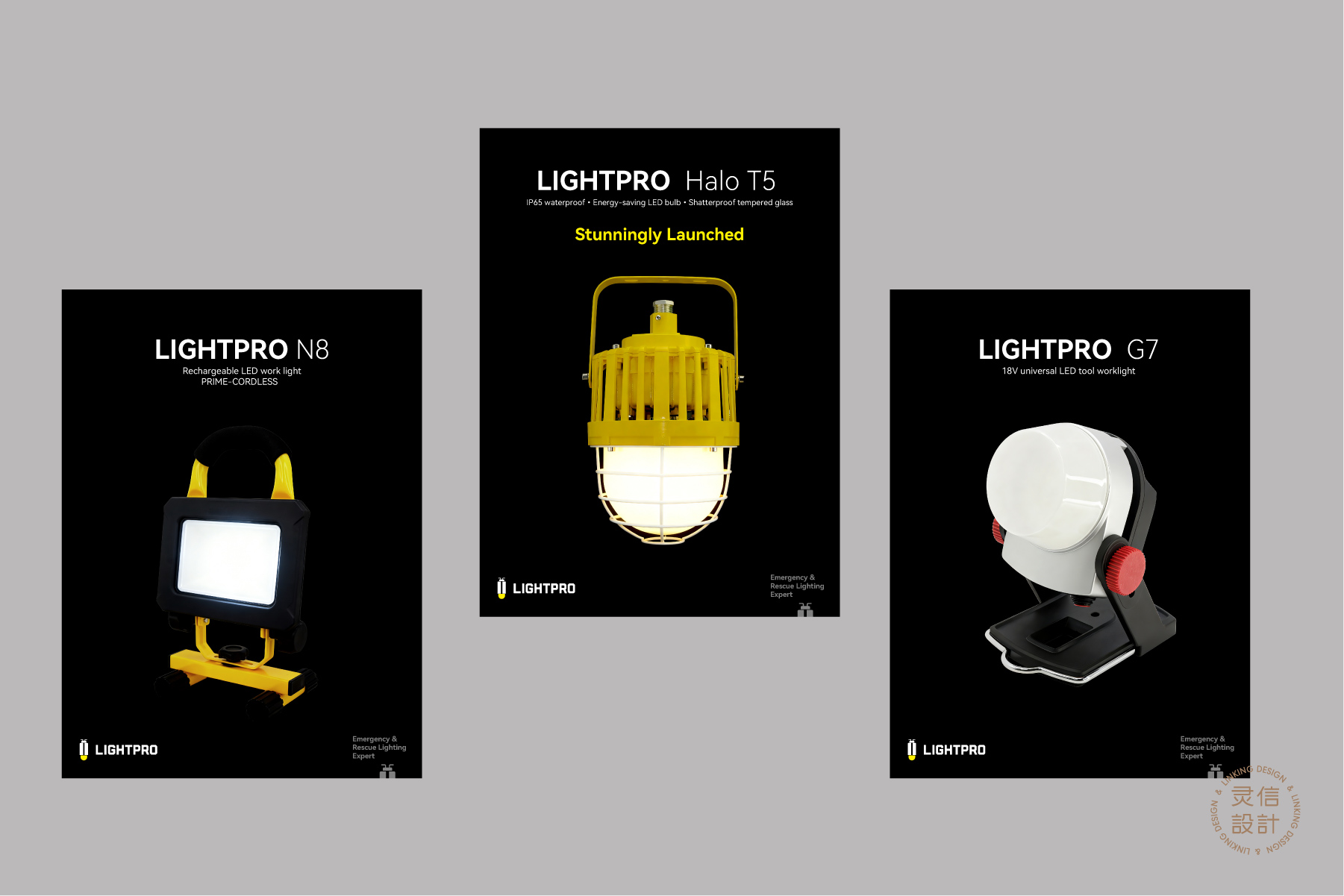
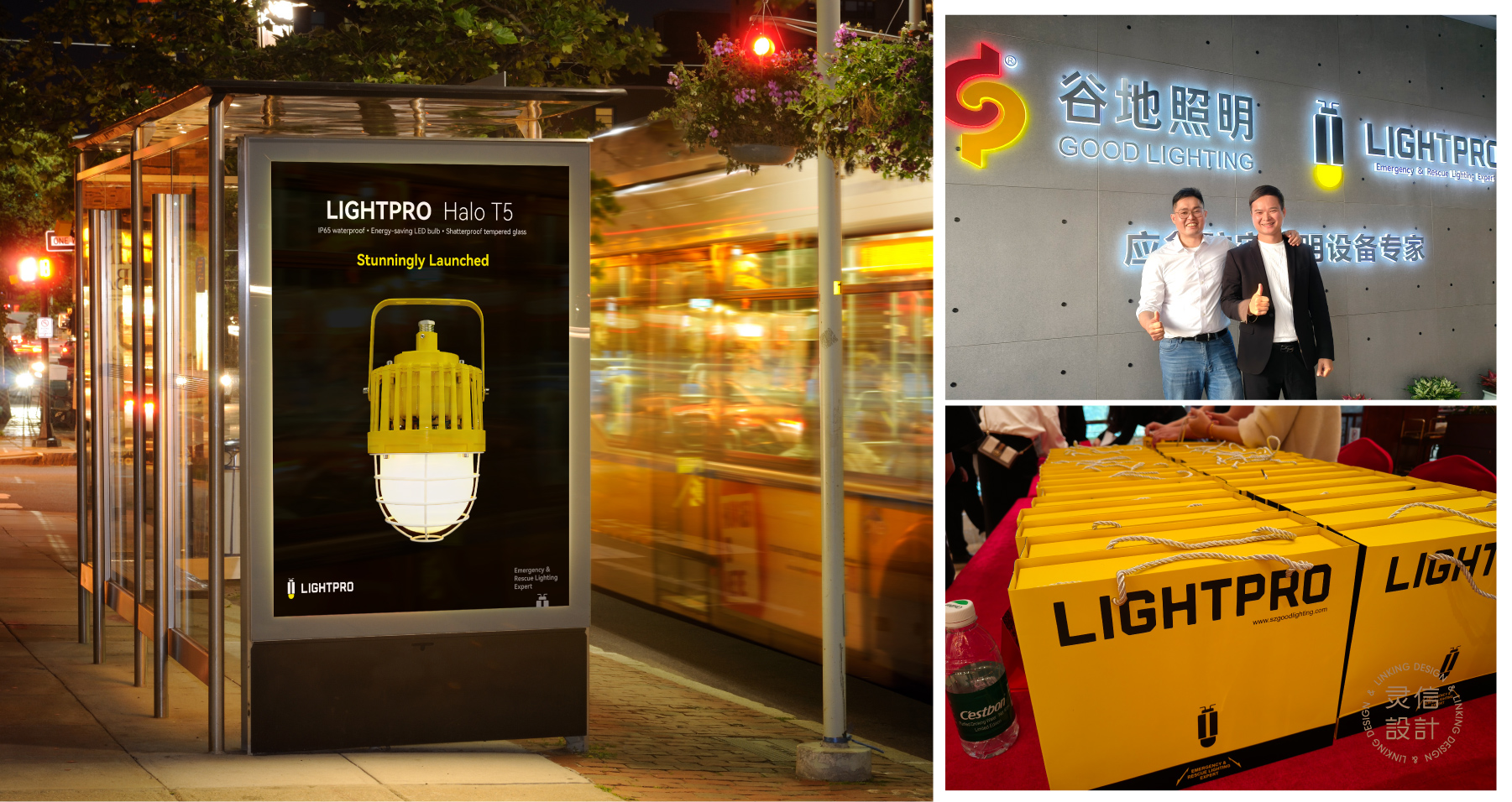
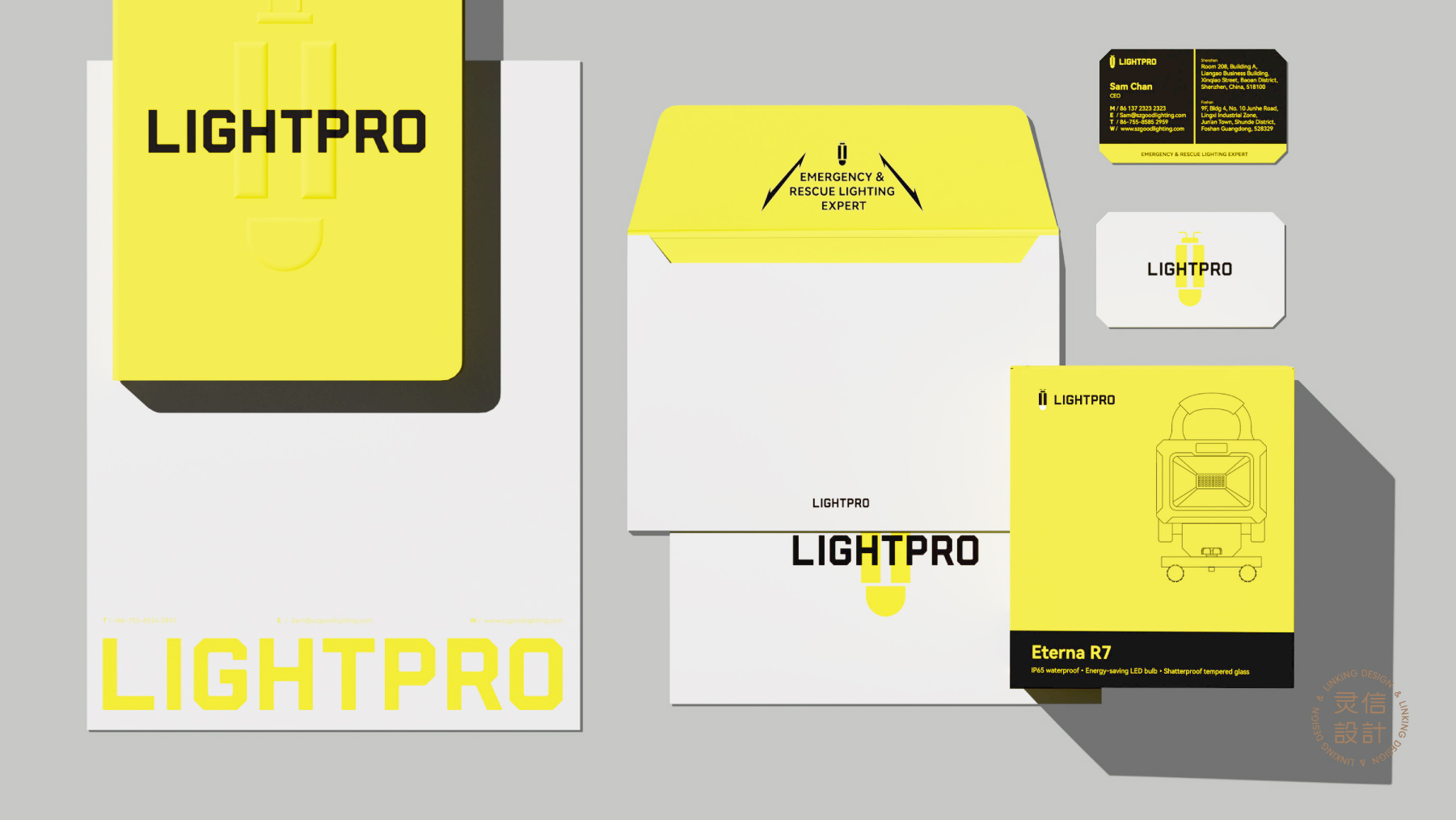
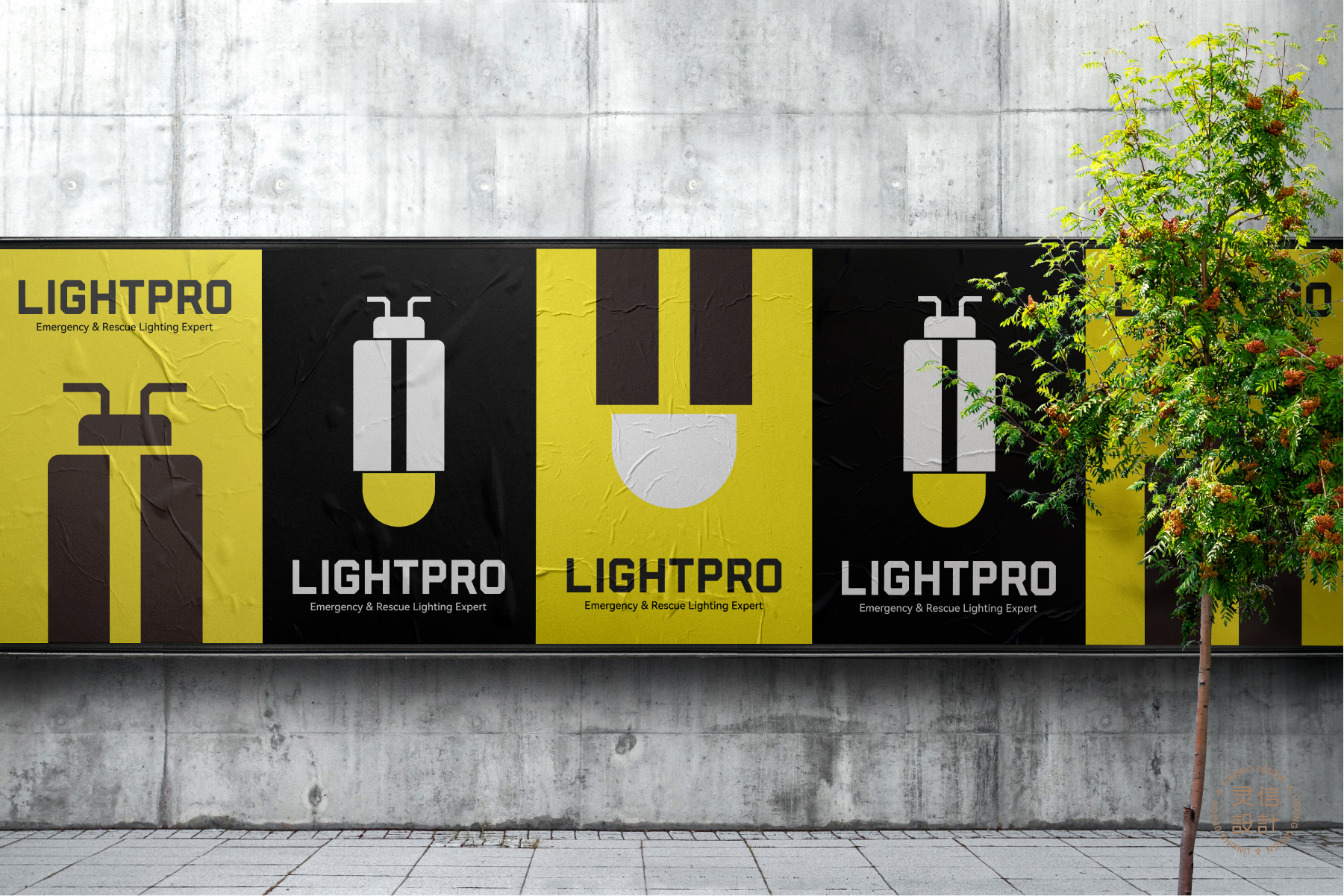
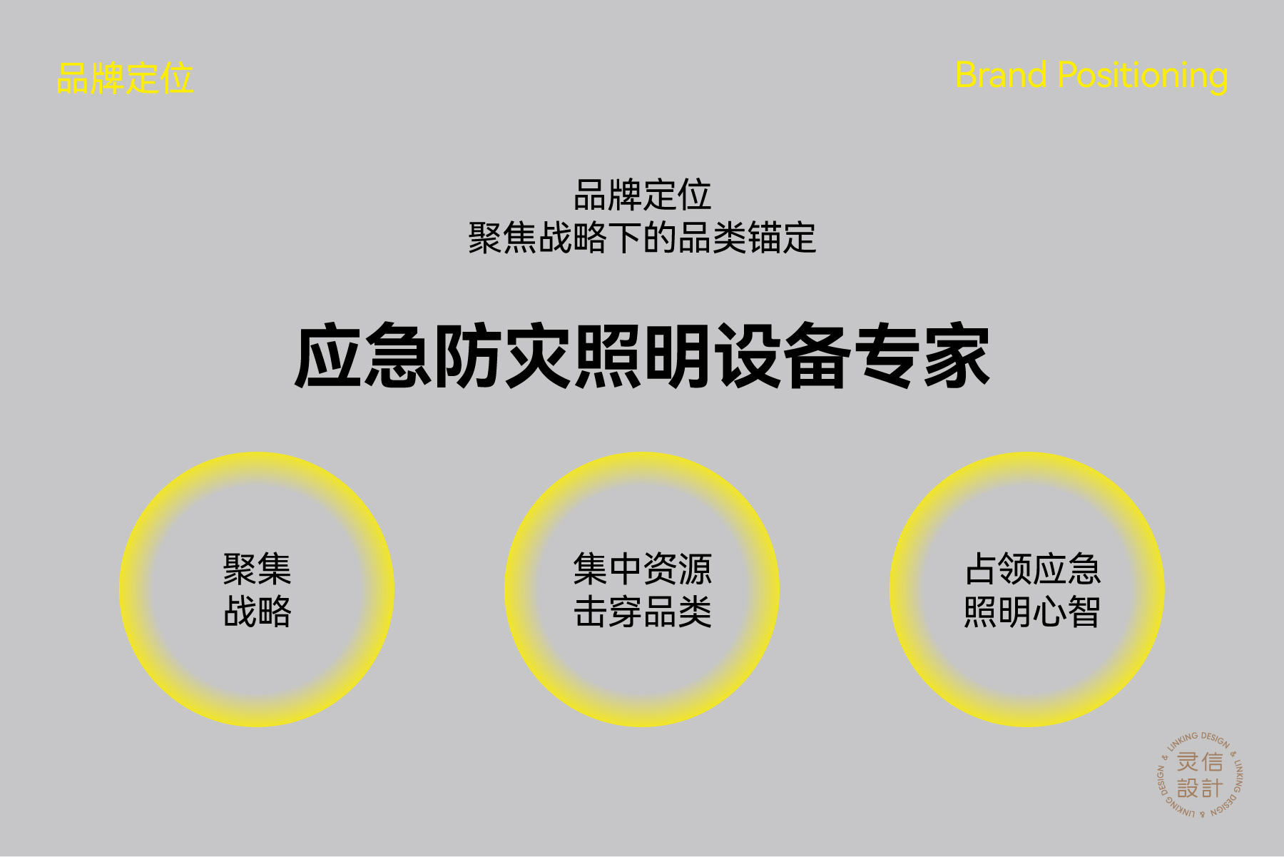
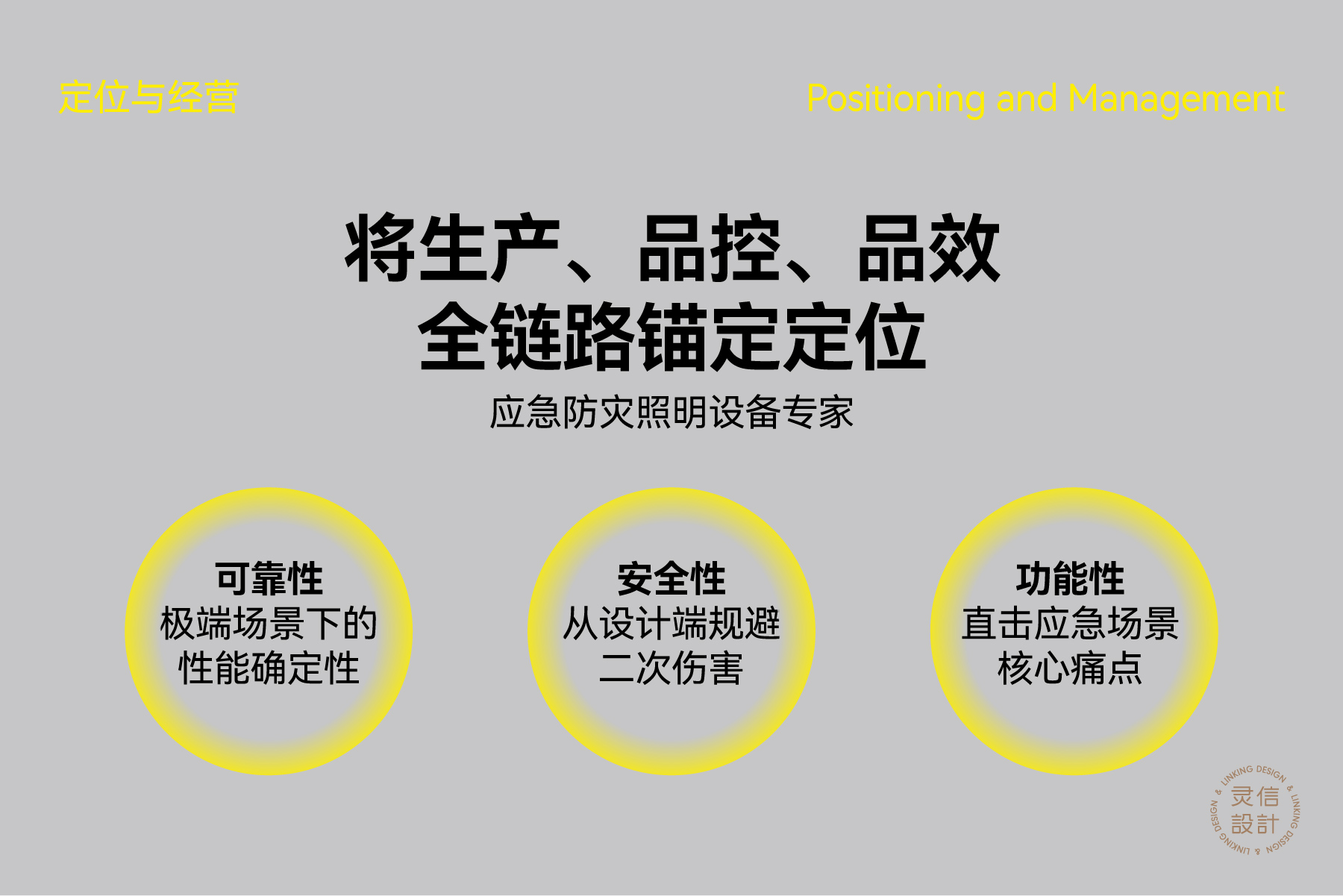
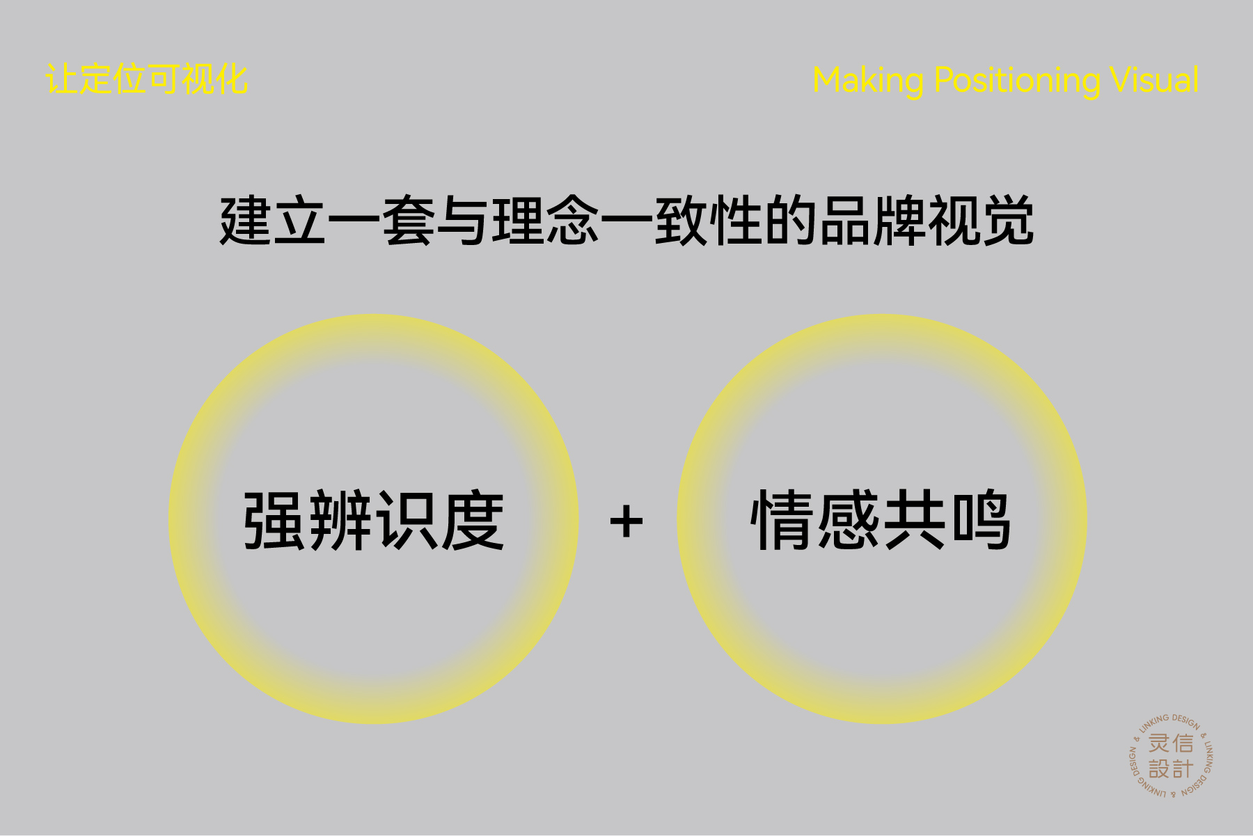
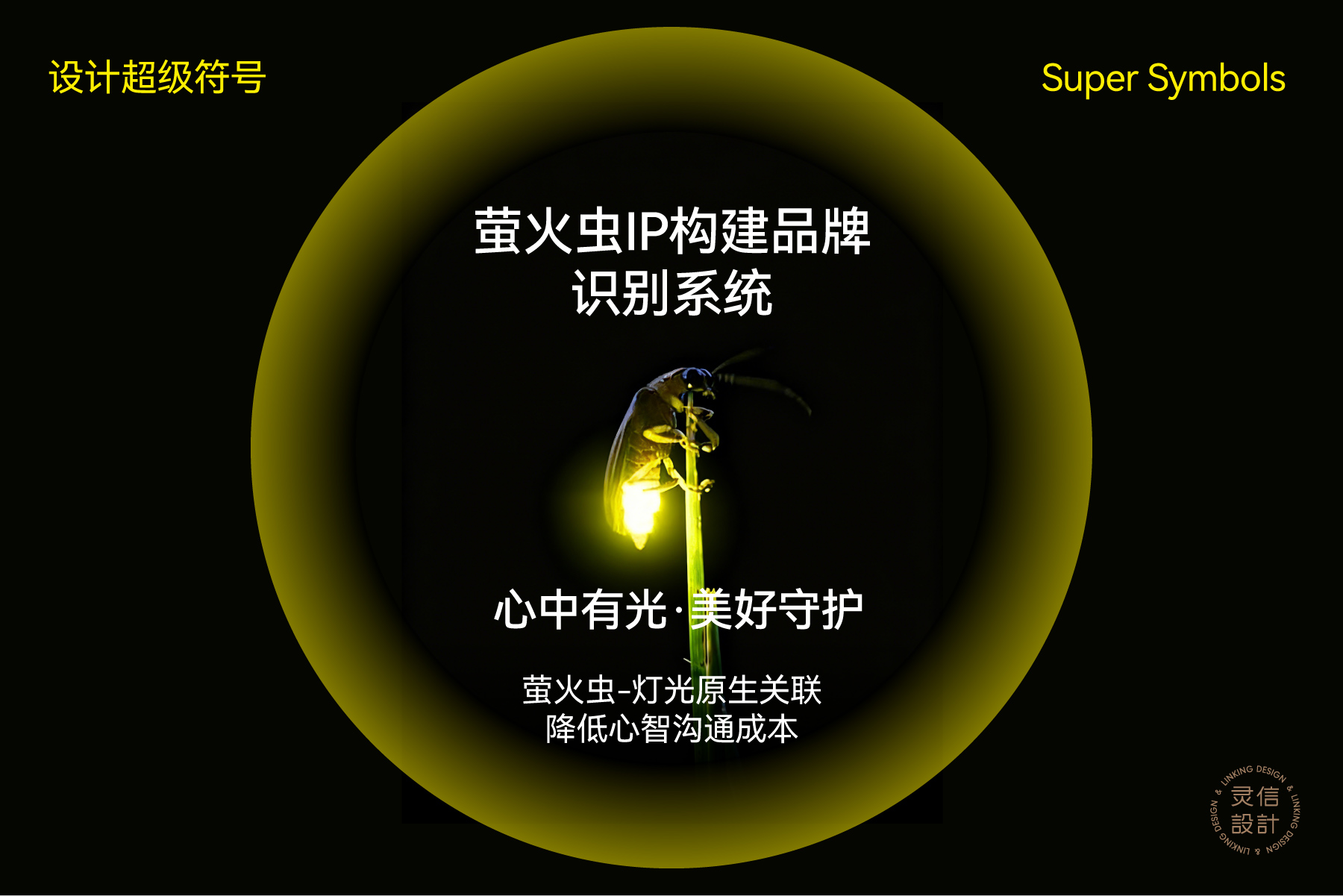
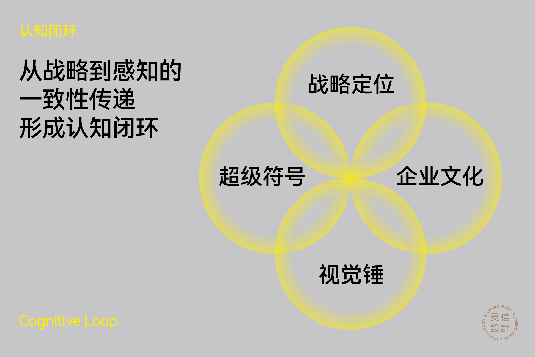
LIGHTPRO确立“应急防灾照明设备专家”核心定位,以聚集战略集中资源深耕品类,构建行业认知壁垒,生产至品质全链路锚定定位,依托“极端环境稳定运行”的可靠性、“规避二次伤害”的安全性及“直击应急痛点”的功能性形成核心支撑。品牌以萤火虫为超级IP,承载“心中有光·美好守护”理念,其与灯光的原生关联降低认知成本,且符号可延续复用。视觉体系以“定位+IP”为核心,提取萤火虫与灯光元素构建主标识,搭配适配应急场景的色彩体系,实现全触点视觉统一。全案以“定位→IP→视觉→企业文化”形成认知闭环。
LIGHTPRO has established its core positioning as "Expert in Emergency and Disaster Prevention Lighting Equipment". It focuses resources on deepening the category with a concentration strategy to build an industry awareness barrier, and aligns the entire chain from production to quality with this positioning. Its core support lies in reliability ("stable operation in extreme environments"), safety ("avoiding secondary injuries") and functionality ("directly addressing emergency pain points"). The brand adopts firefly as its super IP, carrying the concept of "Light in Heart, Beautiful Guardian". The inherent connection between fireflies and light reduces cognitive costs, and the symbol is scalable and reusable. The visual system centers on "positioning + IP", extracting firefly and light elements to build the main logo, matching a color system suitable for emergency scenarios to achieve consistent visual identity across all touchpoints. The whole case forms a cognitive closed loop of "positioning → IP → vision → corporate culture".

![]()